Ideaflip's story
Origins
Cast your mind back about fifteen years. The social media space was fluid; platforms arising, booming, bursting. Internet access was widening, and people were interested in creating and consuming in completely new ways. This melting pot was the very beginning of today’s Ideaflip.
To wind the story back to its origins, I spoke to our co-founder, Andy Wood. Andy had met Ian Millington at the University of Birmingham, where they studied PhDs in Software Engineering. A decade later, after both had built and exited start-ups, the pair got back in touch and began working on a few projects for fun.
One that stands out: MyStickerLicious (“ridiculous!” laughs Andy). Somewhat frustratingly similar to the giant that is today’s Pinterest, MyStickerLicious was named so due to similarities with MySpace, the link-sharing site del.icio.us, and the sticker-like qualities of the elements.
The site stayed mostly private, but the essential learning had taken place: it was possible for the two to work together and create, from scratch, a visual idea-sharing platform.
Flexibility is key
The release of Adobe’s Flex 3 (now Apache Flex) was another milestone. The duo soon realised that Flex allowed them to build sites that were far from the standard grid layout at the time of tables and buttons.
“Flex allowed us to actually code a lot of this fancy, fluid stuff,” explains Andy. “Whereas previously you had to use visual tools to build websites, we could suddenly code - in this open-source way - Flash websites.”
“We had this vision of a playful social space. We imagined users being able to drop all sorts of widgets in - some images, some bits of text - and put them together to create something ephemeral; not quite a normal web page or a blog.”
The interactivity of pages combined nicely with Ian’s gaming background. The core concept became more playful: users could place and move characters in response to others.
As the idea grew, Andy and Ian started to believe in the possibility of gaining funding to develop it. But first, they had to make their ideas concrete, communicable.
Taking shape
“This is where the real Ideaflip started,” says Andy. London, 2008. They met up with Benjamin Dives, a contact of Ian’s from his AI work, and Lauren Bugeja, a UI/UX expert friend of Ben’s over from Australia.
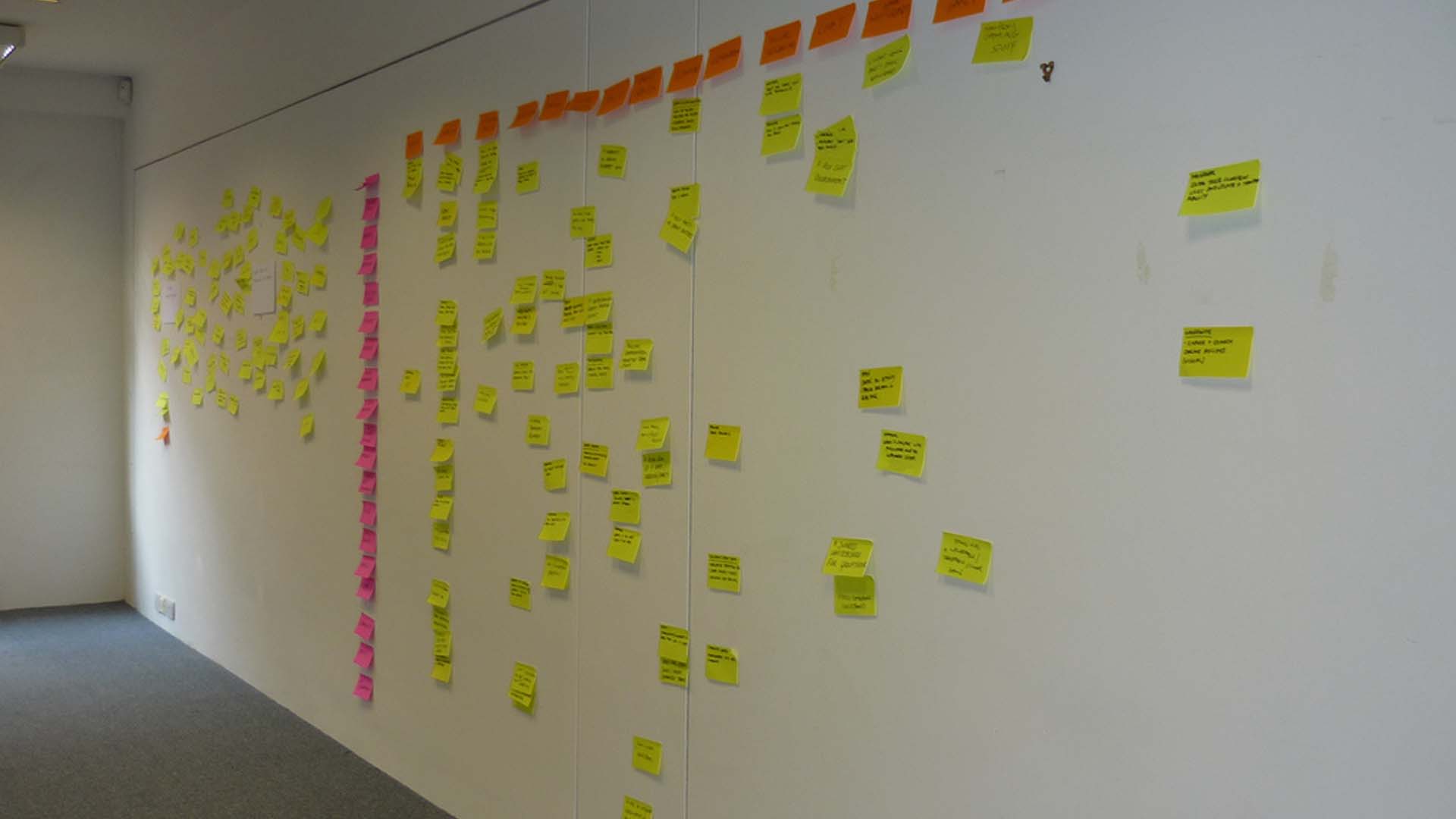
The group converged in a nondescript office space. You probably know the type; large room, empty white walls, a couple of lonely desks in the middle with a stack of Post-It notes and Sharpies. Andy, Ian, Ben and Lauren thought about all the things they wanted to do - and, crucially, why they might want to do them. Every idea got a sticky note.
“At the end of it all, we came away with this weird little thing, which was the idea of a disposable website. The word disposable now has all sorts of negative connotations these days, but we were thinking of it more like an online scrap paper tool,” explains Andy.
“You might use it to design party invites: a map of where the party is, a calendar, a reminder, pictures of the people that might be there or some ideas for costumes or whatever. And we got a bunch of funding, which was very exciting.”
Fast forward a few years. Lauren had moved to the US, where she now works with Google. Andy and Ian had created various tech tools with Ben’s help (including a successful printing layout app) and sold them on to various different companies.
In the back of their minds remained the image of all of those sticky notes in the big white office in London. What if they could help others to create that experience of idea bouncing, sharing, developing? And given that the writing was on the wall for Flash, could they do it in a different programming language?
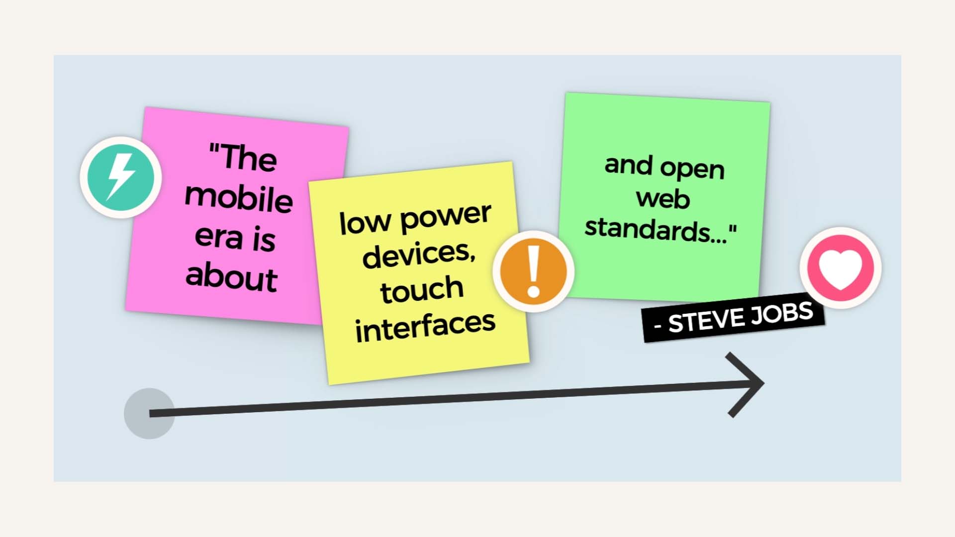
HTML5 was one of the “new open standards… [that] will win” according to Steve Jobs, whose open letter in 2010 made it clear Adobe’s Flash would never be used on iPad, iPhone or iPod. (Understandably, Adobe wasn’t keen on their darling being abandoned en masse but conceded defeat to HTML5 in 2011. As of 2021 Adobe, “recommends all users immediately uninstall Flash Player”.)
GroupZap is born
Initially, Ian and Ben led the concept of a sticky note app, while Andy was unconvinced. “I was kind of like, ‘That’ll never work! Why would anybody want to use that? And how?’ Rewriting everything from scratch felt like a big deal as well.”
Over the course of a few weeks, Ian knocked up a demonstrator and explained the technology, which brought Andy around to the idea. “Once I'd seen it actually working, I was like, ‘Ohhhh, okay! Now I get it. This feels like it could be very interesting.”
It was a pivotal moment - but the group had reached the end of their first round of funding. Ian and Ben were pulled into other projects and Andy took a freelance contract, but everyone involved knew this idea had value.
“We didn't want to lose this, but we decided that it wasn't going to be a quick win. And so we effectively just hibernated the company. We got it to a stage where it was able to go online and gradually, in our spare time, built it up.”
The quietly growing, slowly iterating site was called GroupZap (clearly, choosing names still wasn’t a strong point!). Nonetheless, GroupZap would grow into today’s Ideaflip over the course of the next few years.

The pivot
“The business model wasn’t working,” Ideaflip co-founder, Andy Wood, tells me. Knowledge of this kind can seem obvious in retrospect. At the time, of course, it never is. “We had a novel kind of pay-as-you-go token model, but this was unusual, difficult to use and put barriers in the way of using the service at the point when users just wanted to get on with collaborating.”
Subscriptions seemed to be the way the software industry was moving. Even Adobe, whose original product Flex had been so instrumental in the early days, had decided to switch to subscription-based revenue.
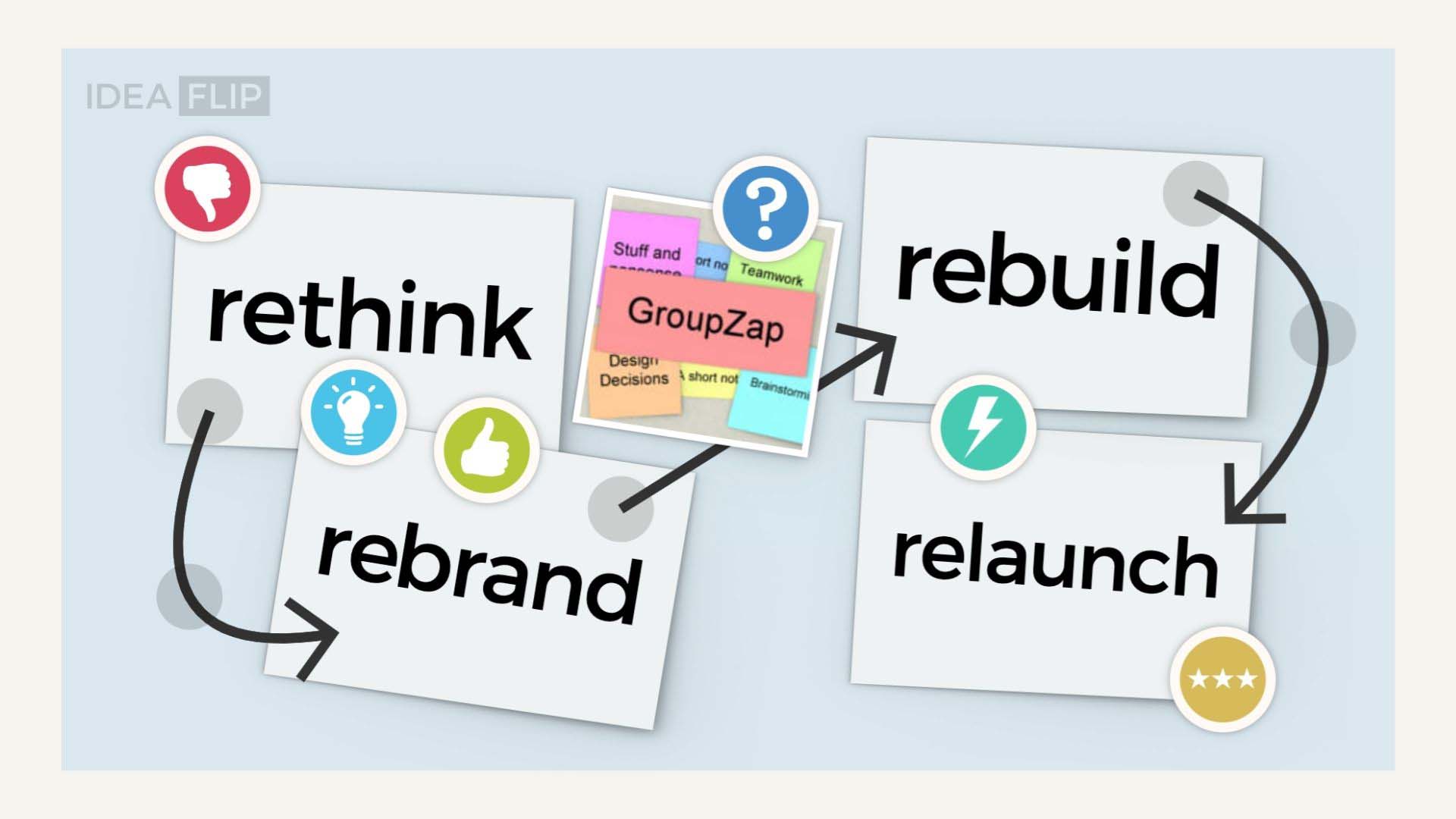
“So we rethought it all and decided to make it into a standard subscription service so our users could just jump in and use it as often as they wanted to.” Alongside the business model rethink was a rebrand.
It was time for GroupZap to come out of hibernation.
Goodbye GroupZap - Welcome Ideaflip
Inspired by a conversation around a flipchart, the team settled on the name Ideaflip. With a new logo, refreshed colour palettes and some neat new design elements, the rethink and rebrand were complete.
Next up: “We rebuilt the entire website using that new branding. It was the same sort of idea, but it was a complete rewrite from the ground up. Entirely new technology under the hood, but very similar in terms of the actual functionality.”
Rebuild complete, the fourth and final step was relaunch. Crucial at this stage were the current GroupZap users. We all know what it’s like to log on to our email, Twitter, Instagram or other oft-used platforms to find buttons shifted, colours changed or features feeling uncomfortably out of place. How did long-term GroupZap fans take to a whole suite of visual shifts?
“Quite naturally!” says Andy. “Even longtime app users migrated across to it happily. In terms of the overall experience, we hadn’t changed a great deal. We just made it look fresher.” A key part of this was continued customer support and fluency between the two designs. For example, old boards could be easily imported into the new system.
Furthermore, users who didn’t want to switch weren’t forced to. “We left the old system going as well, actually, for quite some time. So the two versions kind of ran in parallel with each other.”
Perhaps seeing my surprise at this, Andy expands: “In some ways, that's kind of an interesting model, I guess. There's this idea that you have to keep pushing things forward. But people don't really like huge amounts of change. And for us, being a small team, the process had to be pragmatic.”
The term user-centric is in danger of becoming the latest tired buzzword in design circles, but it seems the team really were focusing on what their customers wanted. Perhaps this is why Ideaflip really started to gain traction at this stage. Ideaflip was on the up.
A mystery spike in usage
“I don’t know why it didn’t click. But around March 2020 time, we had two massive great spikes in usage. And to start with, I just didn't put two and two together with what was going on in terms of the pandemic.”
We all know the story: country after country locked down. Millions of people across the world were forced to stay at home. Remote work was slowly increasing before COVID19, but the pandemic pushed rates off the charts. Those who could work from home began a huge professional shift - and quizzes with friends, catch-ups with family, and partners communicating between households meant that the changes became personal, too.
Ideaflip wasn't the only company to see an uptick in usage, of course. Zoom had a twenty-fold increase in users between January and April 2020. Whether the Zoom Boom is sustainable is a whole other question (and one which Emily Cashen attempts to answer in her special report for World Finance).
Opinions are split on whether service-based economies will ever return to offices. Reports and think pieces on the post-pandemic workforce abound, but the overall consensus seems to be a hybrid of the current WFH model. Whatever happens, it’s clear that people don’t need to be physically near each other to do good work, and we’re going to continue to need tools that help us communicate in a variety of ways without the wasteful overheads of travelling.
As the pandemic restrictions eventually eased over 2021 would Ideaflips' enlarged user base disappear? "No, it looks like the majority of users discovered the value of using Ideaflip and are continuing to enjoy how it helps with their work."
What’s next for Ideaflip?
Sometimes improving isn’t about adding new features, but about doubling down on what you’re doing well already. “We don’t want to be just another piece of web software, I guess,” agrees Andy. “One of the things that people say they like about Ideaflip is that it looks and feels different. Intuitive, but simple and playful. That was one of the things that Ian insisted on really early on.”
So what’s the team working on now? There’s an ongoing exploration into how Ideaflip boards can become even more useful and enjoyable for collaborative work.
“We want Ideaflip to feel like a non-digital space where people can comfortably work together without being forced to make binary yes/no decisions before they’re ready to. Allowing room to explore problems, options and ideas -- without always having to make decisions to place things in a specific box straightaway.”
“A place where teams can be human and organise in the way that works best for them, but all the while retaining the power of software over pen and paper.”
Less is more
While competing tools are on a never-ending quest to add more features, Ideaflip is focusing on making their core functionality as good as it can be. Andy explains to me the theory of minimum viable toolset.
"We are always searching for the minimum set of tools and options to enhance our user experience but not over-complicate it."
“Our belief is that a collaborative drawing package or whiteboard is not the same as an effective communication toolkit for teamwork or workshops.”
“It might look simple, but each Ideaflip board actually has quite a complex data model. So we’re working on ways to give our users a small set of easily understandable tools that they can combine in really powerful ways to take advantage of that.”
Intuitive, simple and playful - just like our original plans. Ideaflip may have changed its name over the years, but its core purpose remains the same.

Making a difference
Seeing global corporations use Ideaflip for collaborations with people across the world is gratifying but is also environmentally important. The amount of CO2 created by travel to have face-to-face meetings is enormous.
"If we can make businesses and organisations get used to having the majority of their meetings online then we have made a small difference to the global climate emergency."
Ideaflip is a purpose-driven company keen to not just be financially successful but playfully help people work together and encourage a low-carbon future, explains Andy, and with that, we wrap up the interview.
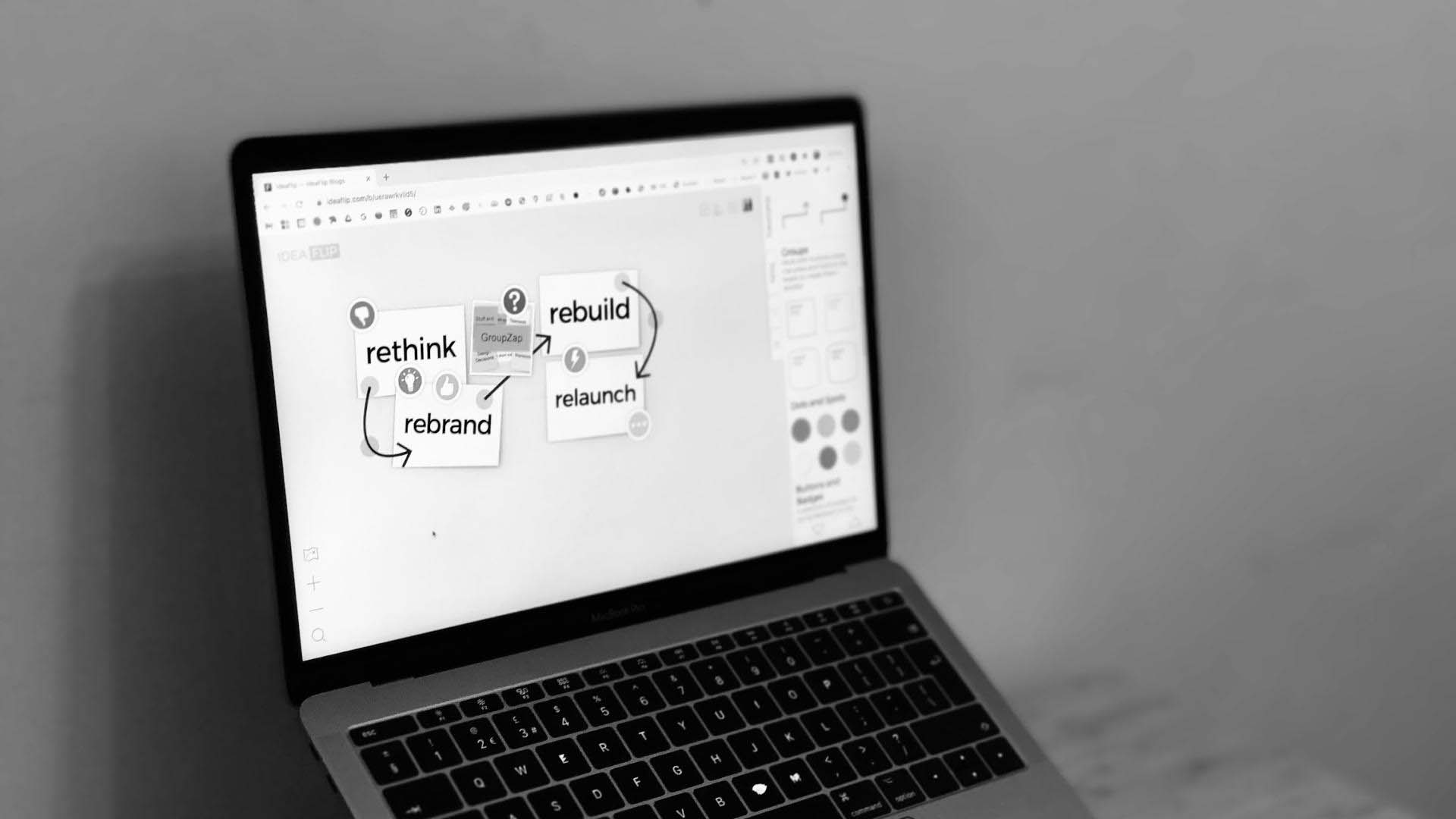
I collect my notes and head home. Now to organise all these scribbles, I reach for my laptop and head straight to ideaflip.com - but of course, I would - there is no better tool!
Written by Bex, lightly edited by Rob. Many thanks to Andy. Try out Ideaflip for free here.
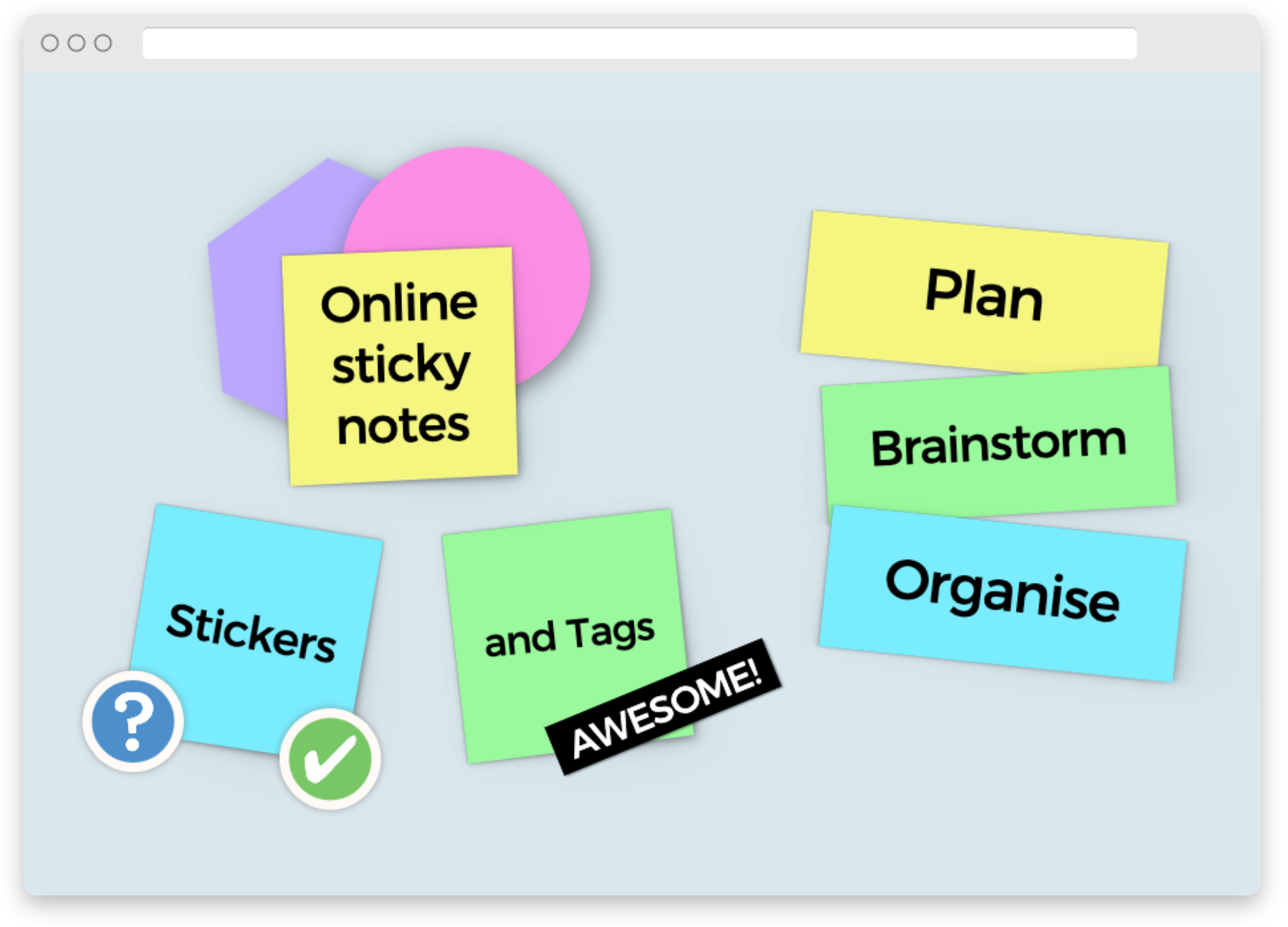 Online sticky notes to plan, organise and brainstorm with your team remotely